The branding & core Ident..
The Server..
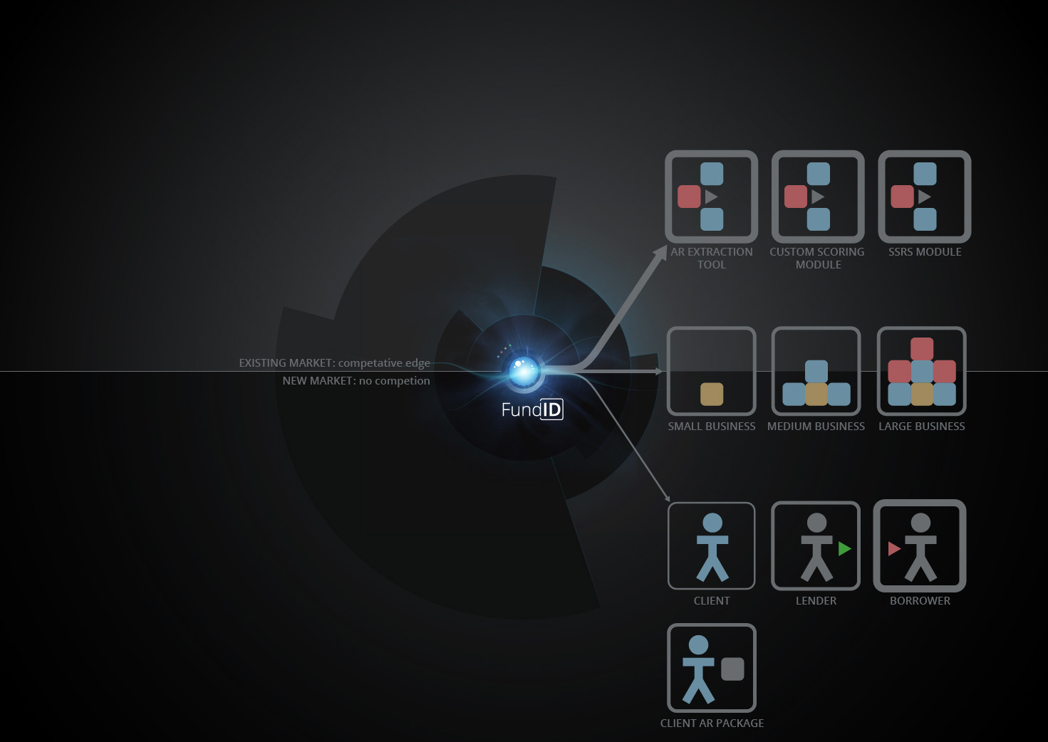
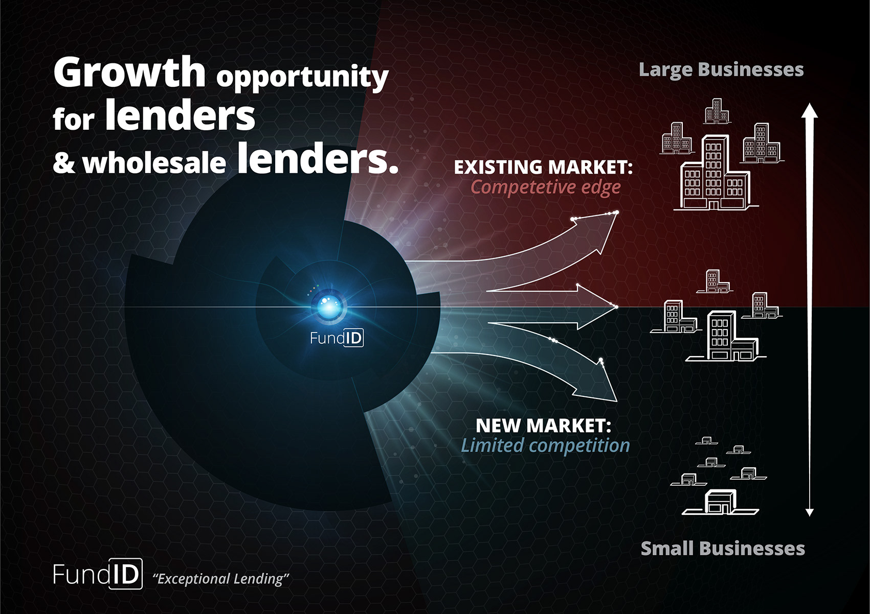
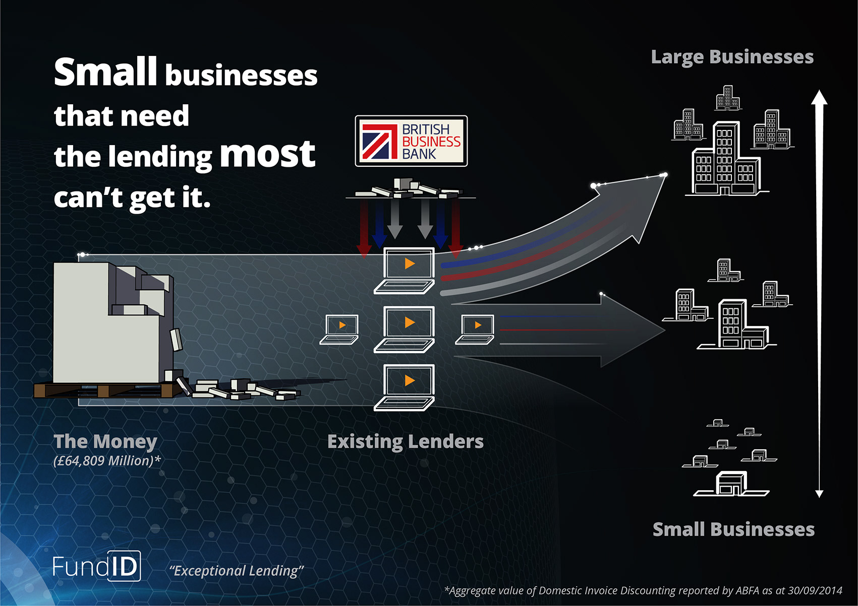
The software itself is focused on bringing funding to smaller businesses, where the money is so desperately needed.. It’s easy for lenders to lend to large corporates with a small associated risk, but very difficult for them to do the same for the smaller more entrepreneurial startups for example. This software is designed to take away the risks by redirecting the funds, enhancing the security and thus opening the door to the little guy..
Initial Moodboards..
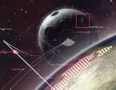
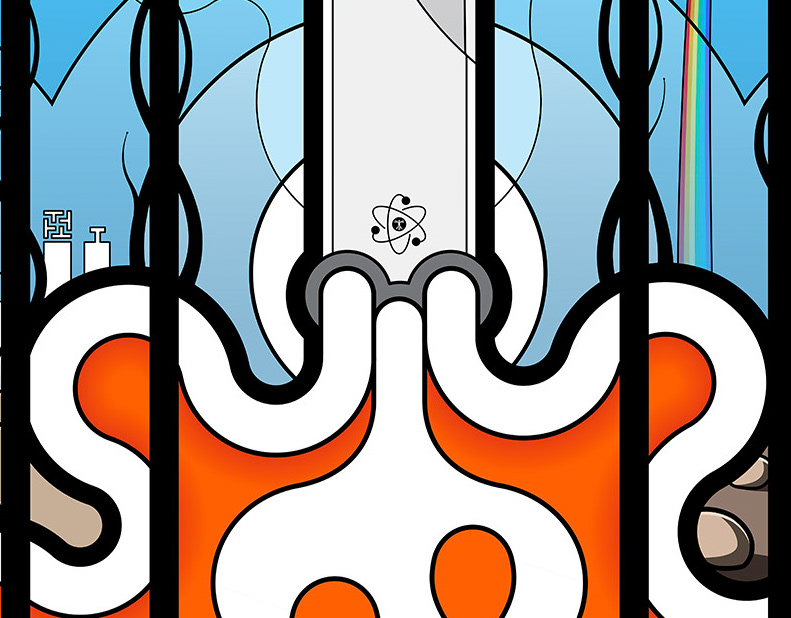
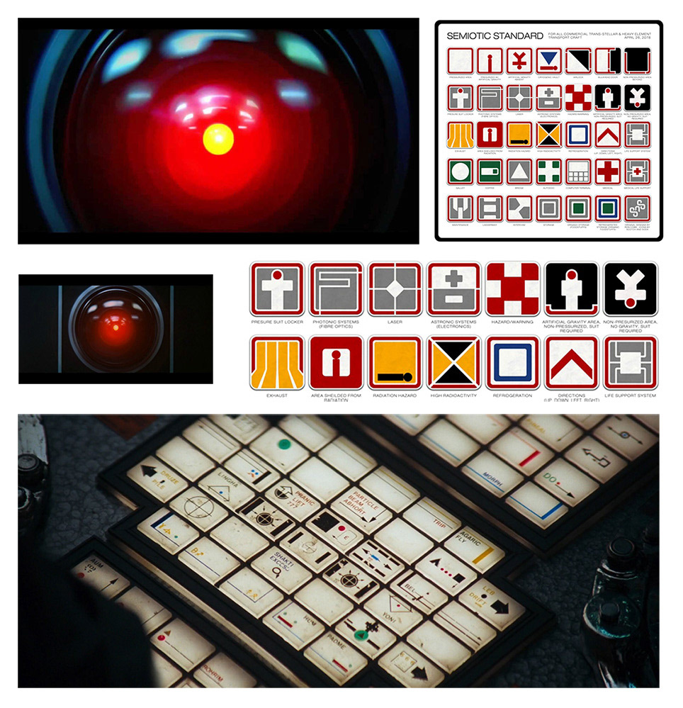
The concept I presented to my client centred around the idea of the main server [the FundID software icon] as the central core element to the entire graphical language.. My idea was to have a little red light as the core aspect of the brand, think HAL form Kubrick’s 2001: A Space Odyssey [see moods], or an ‘ON’ indicator on a piece of hardware [the main server]. It also suggested an eye roaming/looking for the data link between the client and the finance they need..

1st concept..

The ‘Eye’ let’s call it, sits within a background texture of gunmetal greys and blown out blacks and is switched on [glowing red] and positioned in view when relevant to the slide content, and out of view when not relevant to the slide.. When the server icon [the eye] is NOT in frame and relevant to a particular layout it still effects the background texture [the landscape] but cannot actually be seen within the frame [see slides below]..
Overlaying this base element, is the icon style for the modules and businesses and any other elements that will require some icon design further down the road. Initially I was thinking something like the signography you see on the ‘Nostromo’ above the doors etc in the movie Alien [see moods]. However my client felt this was too sci-fi for his older clients/investors to cope with and may have been alienating [excuse the pun], so we went down a much more basic literal route regarding the small icon overlays, as can be seen in the final slides..
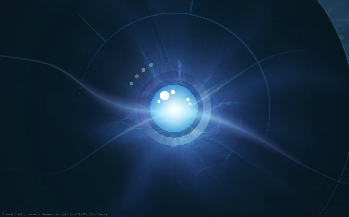
The beauty of the core concept [the Eye] is that it can simplified down to a simple red dot or developed up into a full on 3D graphic..
Developed core concept and icon devs..
Overlaying this base element, is the icon style for the modules and businesses and any other elements that will require some icon design further down the road. Initially I was thinking something like the signography you see on the ‘Nostromo’ above the doors etc in the movie Alien [see moods]. However my client felt this was too sci-fi for his older clients/investors to cope with and may have been alienating [excuse the pun], so we went down a much more basic literal route regarding the small icon overlays, as can be seen in the final slides..

The briefing document for the actual promo slides..

The final artworked slides: Pg 1 Cover Art..
Clearly, during development the Red Eye became a Blue Eye.. It was felt [quite correctly] that the Red Eye was too threatening and not friendly enough, so we opted for a friendlier blue version of the same concept..
The final artworked slides: Pg 2..
The final artworked slides: Pg 1..

The final artworked slides: Pg 3..

The final artworked slides: Pg 4..
The final artworked slides: Pg 5..

The final artworked slides: Pg 6..

I still like the red eye though, even without the extra development the blue version received..